It’s chart makeover time for the #SWDChallenge and I picked something frivolous of great importance for this one. A source of immense frustration when shopping for clothes: inconsistent clothing sizes.
Despite knowing full well that clothing brands are just messing with your head, trying on new clothes typically results in either of two emotional states: an existential crisis because you can no longer fit in clothes 3 sizes too big, or misplaced smugness since your regular size now fits like a sack despite the mirror reflecting no real change in your body shape. You know it’s all just a big lie, but your resultant yo-yo-ing self esteem can send you calling your therapist to check how soon they can book you in for a session.
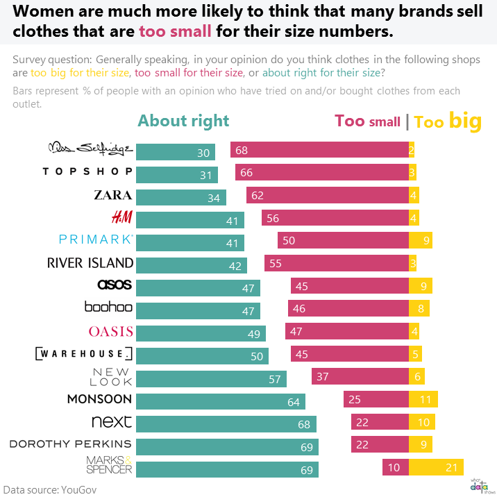
Which clothing brands toy with your fragile emotions the most? Check out this chart to see how your favourite retailers fare.
The chart above is a makeover I did of this one from YouGov:

Why was a makeover needed?
This wasn’t a bad chart in the vein of 3-d clustered bars or excessive categories, and YouGov generally does decent charts. But certain aspects of this were impeding my need to quickly pick out what I wanted to. There were 2 things I wanted to know after reading the chart title:
- Who were the worst offenders?
- And who was getting it mostly right?
The trouble with the original YouGov chart was that it sticks the ‘getting it right’ category in the centre of the bars making it hard to read due to a lack of a consistent baseline for it (i.e. the typical issue with stacked bars), while the “wrong” categories are at either extreme. This combined with the fact that the worst offenders are shown at the bottom creates an incongruity when trying to answer the question posed in the chart title.
How I fixed it
- The first thing I wanted to understand was who was getting it mostly right and who was getting it really wrong. The direction of wrongness was a secondary insight for me. So I split the chart up into 2 separate ones. The first is a bar chart that shows brands that were mostly getting sizes right according to respondents, ordered from most to least agreement. And then a separate diverging bar chart which looks at the direction in which brands were getting sizes wrong.
- The colours in the original chart were a bit confusing for me. Shades of green (at least for me) indicate something that’s working right, but quite the opposite is suggested in this chart. I do realize that YouGov was probably sticking to its colour palette but I still wanted to make the problematic areas more apparent.
- Changed the legend up so that the colours for the text mirrored the bars they refer to and made the text larger so they are much easier to match to the charts.
- Changed the font size for “too big” and “too small” to emphasize the whole point of the chart – size issues!
- While I kept the chart title consistent with YouGov’s version, I colour coded the various sizes here as well.
- Also separated the explanation of what the numbers represent from the chart title, because it’s just clearer this way.
- Substituted brand names for logos to make it easier to identify brands you are interested in, and to break up visual monotony. Part of me feels that this may me making the overall chart a bit cluttered, but I still prefer this to just the brand names.
Now let’s talk about the data behind the chart a bit.
Who was interviewed?
While I endorse the fact that brands at the bottom of the chart are pretty evil in their sizing, vanity sizing is definitely a thing too and those at the top of the chart are frequently accused of it. Increasing numbers of people who are obese or overweight would also affect the “trueness” of sizing perceptions, with more and more people considering normal sizes as too large if some brands consistently size up.
But then again, who decides what’s “right” for a size and surely the definition is fluid as societal norms change?
So yes, who answered this survey would definitely be very interesting. But for now we can find solace in the fact that it’s not us, its the clothing manufacturers who are getting sizing wrong and so hand over the peanut butter milkshake please!