My company recently shifted from Tableau to Power BI. And it was painful, as it always is, to say goodbye to something you love and rely on.
I was excited about learning a new tool though. Excited to add something new to my toolkit. But a bit reluctant too. Based on all that I had heard, I went into it with the feeling that Power BI was a step backwards, that I’d now have to make do with an inferior tool.
I’m a few months into the shift now, and I’m happy to report that Power BI doesn’t frustrate me as much anymore. I’ve developed an appreciation for it actually. And although that appreciation is mixed with wistfulness for all that Tableau offered, I have made peace with it.
“Which do you prefer, Tableau or Power BI?
I get this question ALL THE TIME. Quite literally, every single time I mention that I work with both tools.
My instinctive response is always: Tableau.
It’s an oversimplification though. My considered response would have to be: “It depends”.
How do these tools differ? Let me count (or rather, draw) the ways.
1. Tableau = creativity. With it I can hack whatever it is that I want to create. The opportunities are limitless.

Power BI limits you. It confines thinking to typical stuff. I mean yes, you can create custom visuals, but that’s way more complicated than it should be. What that means for quick analysis is that you are stuck with very limited options.
2. Tableau enables data exploration. I can drag fields into the view as I please, visualise relationships, fluidly answer questions that pop into my head, and end up in strange but beautiful places. Who hasn’t found themselves with a complicated-looking chart which probably makes some sense but you aren’t sure of what it’s saying just yet. And that’s how you discover unexpected insights.

When I’m working with Power BI though, I need to begin with the end in mind. I need to know exactly what chart I want to create before being able to visually explore the data. Yes, you can argue that the existing chart types are there for exploration, but come on, that’s just basic profiling. Yes I can change my chart type later, but because of Power BI rigidities, we all know how hard it can be to switch views as you go along. And again, I’m just picking chart types from limited options, not really discovering things.
3. Tableau calculations are powerful, table calculations do have a learning curve, but once you get the hang of them, they all make perfect sense. And the best bit – there’s only one syntax to learn.

One syntax within a single tool should be a no-brainer, right? Well, not in the Power BI world. You can write calcs in DAX, or in Power Query (M language?). And that can be so, so confusing. Yes, eventually you figure out what the purpose of each is, and where and how you should be writing different types of calculations. But that doesn’t remove the pain of constantly having to switch languages within the same tool.
And there’s always a BUT.
4. While Tableau is an incredibly powerful visualisation tool, do not attempt any serious data modelling with it. Merging data sources in Tableau often lands you in a complete mess.
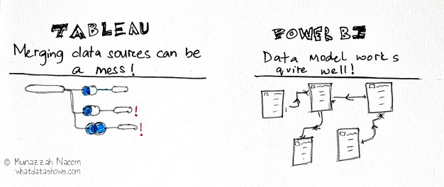
But with Power BI, I’m comfortable doing a lot of more data integration than I would attempt in Tableau. Not a whole lot more, but I can visualise the data model so much better. And with Power Query (yes, the one I was just complaining about), I can neatly see all the steps I took with data prep and shaping, ordered and much more coherent than in Tableau.
5. On the topic of data itself, I frequently deal with requests at work on the lines of:
“Those are nice visuals. But can I also have all the data behind the chart in an Excel table?”
Although I’m trying to slowly wean people away from the “give me all the data” mindset, I have to accommodate some of these requests by providing a data download capability within the dashboards.
The download data capability within Tableau isn’t that pleasant frankly. The downloaded csv can be awkward, with columns that aren’t logically ordered and have strange headers.

Data download with Power BI is a dream. (An accountant’s dream that is.) Power BI excels at providing a lovely Excel table <terrible pun alert>, just the way people want it.
6. There are also some visual aspects where Power BI is more powerful (I should stop with the bad puns now).
Screen resolution issues or whatever, it can be super annoying when, after polishing tiny details of my Tableau viz and being chuffed about the beauty I have created, I publish it to the Server, and poof – it looks hideous. Misaligned containers, truncated visuals, ugly scroll bars – it is a truly soul-crushing moment. I then slink back, deflated, to fiddling around with the Desktop version of the dashboard, guessing at how much to adjust things so that they’ll be in the right spot when published. (Maybe it’s just me with a huge gap in my knowledge here though, and someone reading this might know what the solution is? Please?)

This rarely happens to me with Power BI. Published reports look pretty much as they look in the desktop version.
*same to same is a South Asian expression “used to indicate, usually with a degree of pleasure, that something is identical to something else.”
7. And on the topic of fiddly visuals. Tableau containers are great for ease of layout, but can be super painful too. Why do nested containers seem to have a mind of their own? Why does the container hierarchy morph into such a scary beast, when really, all I want is to create a simple hierarchy of elements? And you can’t even select a container from the Item hierarchy pane and reorder it ?!~#@?

Power BI makes grouping, layering, and reordering visuals so easy with their Selection pane. Seriously, it’s such a time and sanity saver.
8. And for basics – copy pasting text boxes, images, visuals – why Tableau, why don’t you enable this simple functionality which all editing tools have as a standard? Why does this obvious capability need to be so convoluted? And while we are here, Format painter would be nice too, but I know I’m pushing it. Power BI, being a Microsoft product, makes this so easy – as it should be.

There’s good and bad stuff going for both tools basically. What really drives my preference though is the value I place on each of those competing aspects.

For me, Tableau is a complete visualisation platform, a creative tool. It empowers me to create what I want. On the other hand, Power BI is a reporting tool. It creates perfectly good looking business reports and dashboards – if that’s your requirement.
Both are great at what they do – but what they both do is different.
If executive dashboards and a reporting tool integrated with Office 365, with snazzy but not terribly creative visuals, is the requirement, Power BI is absolutely great for it.
But Tableau is what you need when you want to enable for end users all of what Power BI can provide, but much more than that as well.
As for me, I’m perfectly happy with Power BI at work now. Auditors… their visualisation requests don’t get too crazy as you can imagine.
And at the weekends, I hang out with Tableau Public, exploring answers to life’s big questions with data to get my Tableau fix.