You know that unsuspecting moment during a work meeting when you’re asked to “say a few words” about what you do to introduce yourself? Fewer things fill an introvert’s heart with more dread than being put on the spot.
I manage something coherent for my two-minutes-of-fame. But quietly my mind descends once again into a familiar spiral. An existential crisis stirred by an ordinary question on an ordinary workday.
What do I do? Does what I do even matter? What are we all doing here?
The answers are always crystal clear in my head. Why the work I do is super important, to whom and why. Whose life I make easier, how that translates into the bigger picture, and how one pixel and one data point at a time I am helping move the world forward.
But this crystal clarity has an evil twin fighting for the same mental bandwidth, one who pooh-poohs at everything the sensible voice says. And guess which sibling usually wins?
So what is it that I do for my day job?
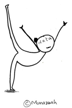
These days, I create dashboards.
“That just involves sticking some bar charts and tables together.”
No, evil voice, that’s not quite right.
Let’s start again.
I create dashboards.
What that really means is I spend most of my time wondering why two sets of numbers which should match, don’t.

The numbers may be coming from the same source, but some records on the way got lost. Or someone’s pulled out their own set of numbers and is insisting there’s more of something that I can verify.
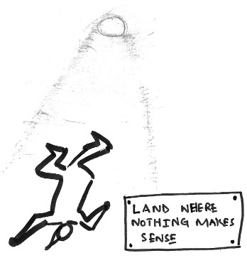
Which requires sifting through records to figure out where one of us has gone wrong. Going down rabbit holes, I find weird and not-so-wonderful peculiarities and inconsistencies, always more questions than answers.
Don’t get me wrong though. Finding problems is oddly satisfying. It’s narrowing down problems that’s usually the hardest bit.
But let’s take a step back. Dashboards start with people. People who need to track metrics and trends, through an easy-to-use interface. It’s these stakeholders who drive the development process. So I start with asking them lots of questions.
Very often people have a seemingly simple request. But once I delve more into the context to understand how they’ll use the dashboard and what problems it solves, things quickly get more complex. Over endless rounds of asking why, how and what next, I help people clarify their ideal workflow, ironing out their requirements with patient and persistent digging. It’s kind of like being a therapist. Or an archaeologist.

But problems more complex than anticipated also require complex solutions. Hardly ever is there neat and tidy data waiting quietly in the shadows for its time to shine in a new dashboard. Inevitably some creative gymnastics are needed to mould the data into the highly specific form that’s needed.

Several gravity-defying moves later, I can finally get down to creating the actual dashboard. This is both the most fun and the most tedious part of the whole process. One long cycle of minute adjustments to hues and shades and nudging containers by pixels to get the design and UI just right. Spanning many iterations of stakeholder input and reworking, it is creatively fulfilling and joy-sucking in equal parts. The culmination of which is a shiny new dashboard.
It ends there, you’d think. Pffft. This is the point where my role of a salesperson / customer service rep begins. Surely the dashboard has changed their life, I tell myself as I slide into stakeholders’ Slack DMs to check how they are getting on with it now that they have been using the dashboard for a bit.
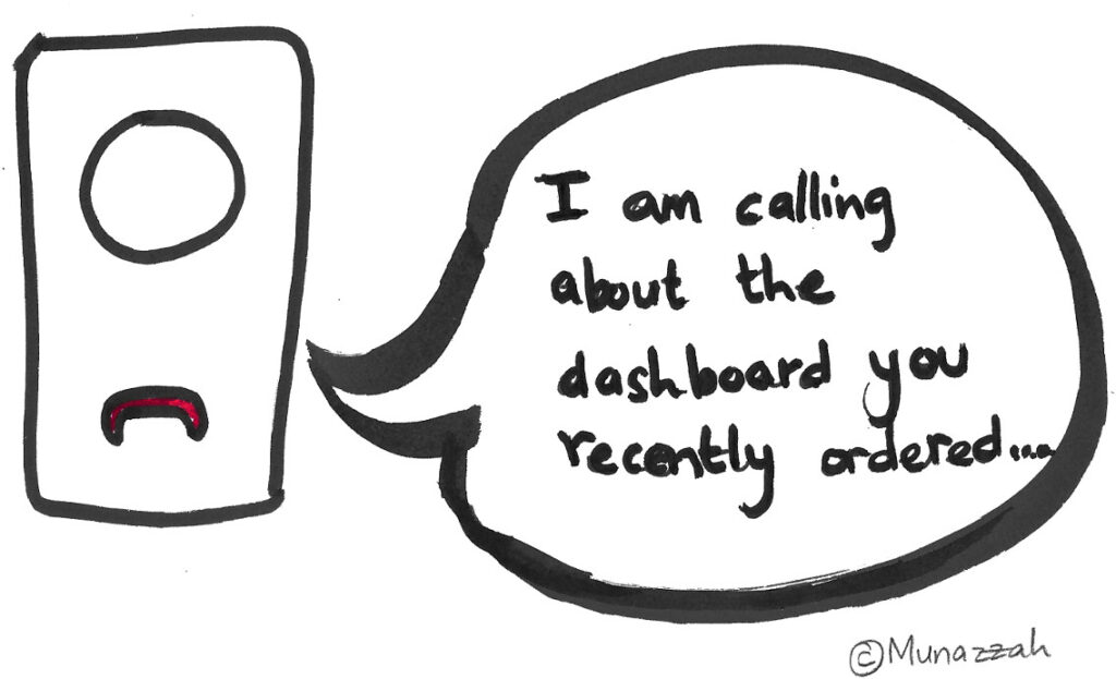
And not altogether unsurprisingly, I discover that some have gone back to their old Excel sheets and pdf reports. “I actually needed [insert something else entirely], and the dashboard doesn’t quite give me that.” That’s right. My dashboard WAS really helpful – in helping them realize what their real problem is.
And so we go back to the start.
Or sometimes it’s just inertia. Preferring to stick to familiar tools, some try to download extracts from the dashboard which they take into Excel to recreate a similar analysis. So I put on my sales and marketing hat, exhorting the virtues of an interactive dashboard over a static file, of visuals over data tables, of real time updates over hunting for the latest file. To slowly wean them off Excel, I iterate on the dashboard to make it as convenient to use as possible and to build their trust in it. Time helps too, of course.
But sometimes, a dashboard just doesn’t cut it. Requirements can turn out to be more complex than a dashboard can support. Other times people do really need a big ass data table – not visuals, not a dashboard, but a giant table.
And so I humbly scrap the work I’ve put in. To recognize when a dashboard isn’t the solution – it’s all in a day’s work.