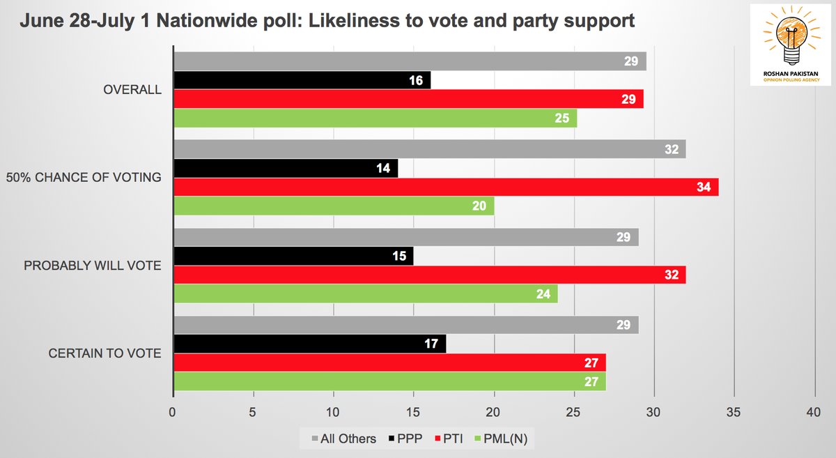
It’s election time in Pakistan, which means an onslaught of charts. Now many of the polls may be of dubious methodologies and national polls get a lot of criticism for being less predictive for seat-by-seat elections, rightfully so when poll quality is also suspect.
As curious as I am about how things will play out, I didn’t really feel like putting this chart makeover out there given the grim realities of this election. It all seemed pretty pointless. But let’s just consider this a tongue in cheek makeover of a chart that had potential but which fell victim to the moiré effect of all the bars.
A new polling firm, Roshan Pakistan Opinion Polling has been pushing out quite a few charts on to our timelines everyday. This particular one caught my attention, because while it didn’t really seem to say anything new, I felt there was definitely something interesting to highlight here, notwithstanding potential poll quality issues.
This is the original image: (makeover follows below)
I used slopegraphs in the chart makeover to highlight differences in degree of support for the three main political parties. Originally intended as a parallel coordinates chart, I ended up doing a slopegraph with four categories instead of the usual two because, why not, this gets my point across.

And then since the intended “joke” in the title is in Urdu, I went ahead and redid the whole chart in Urdu which involved flipping everything around from left to right, Urdu being a RTL script.
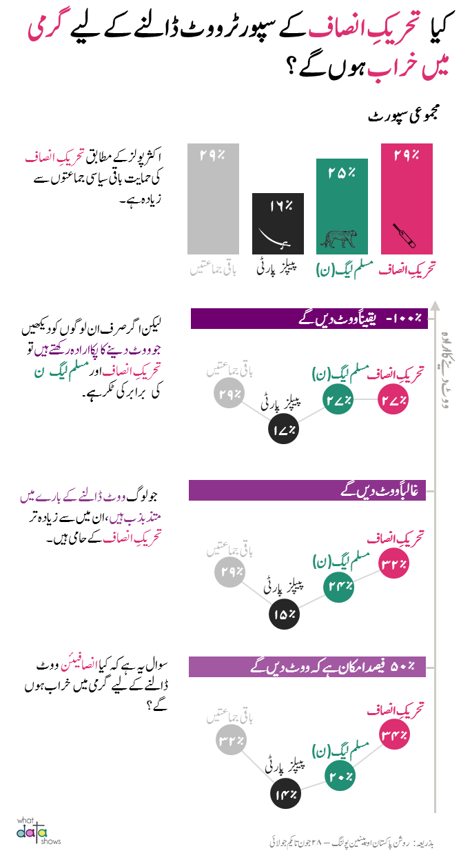
So are PTI supporters actually serious enough to go out and get garmi main kharab and vote? I don’t think we want to know the answer but we’ll find out soon enough anyway.